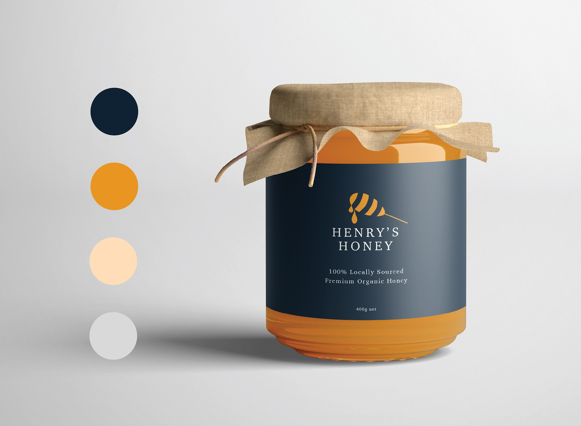
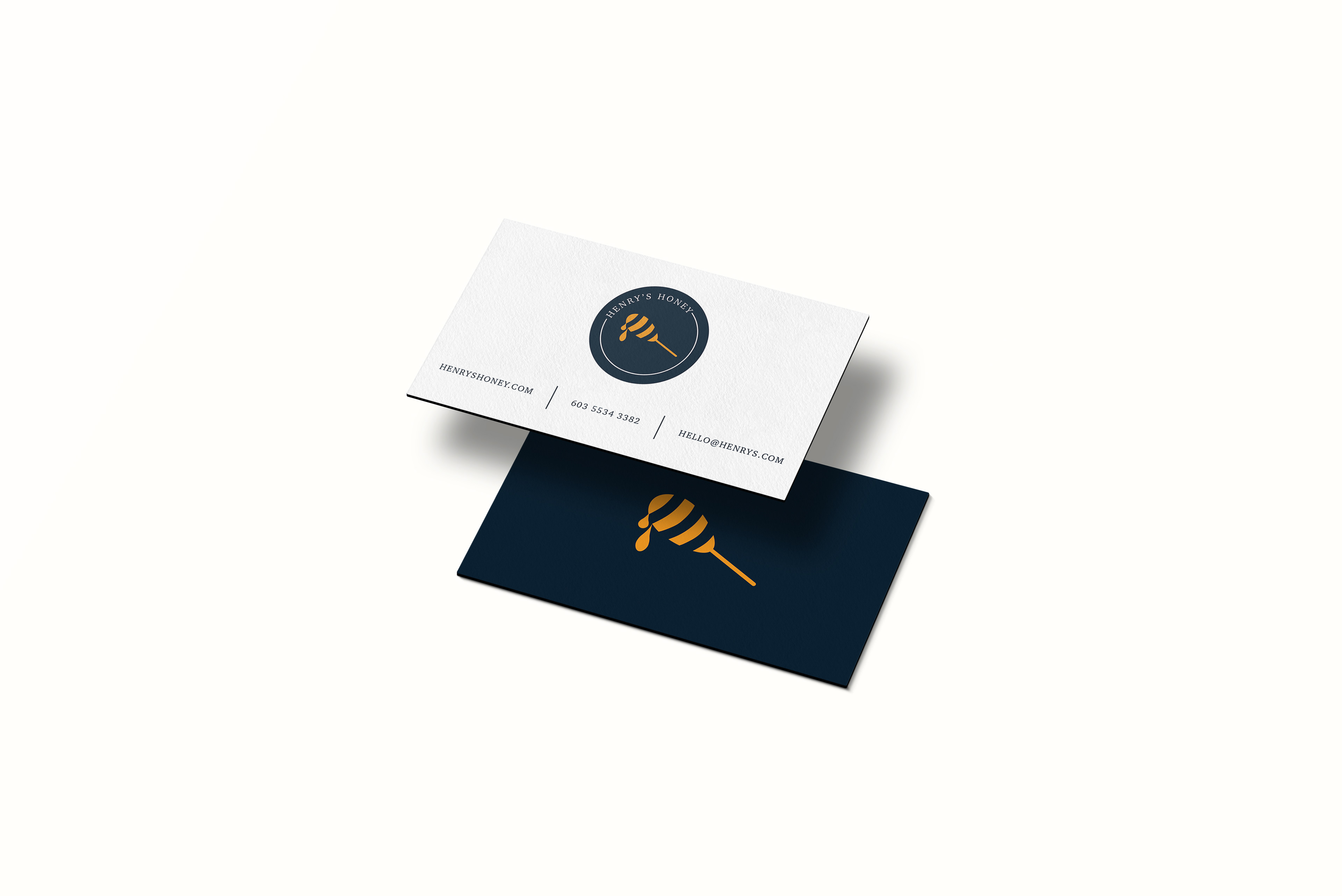
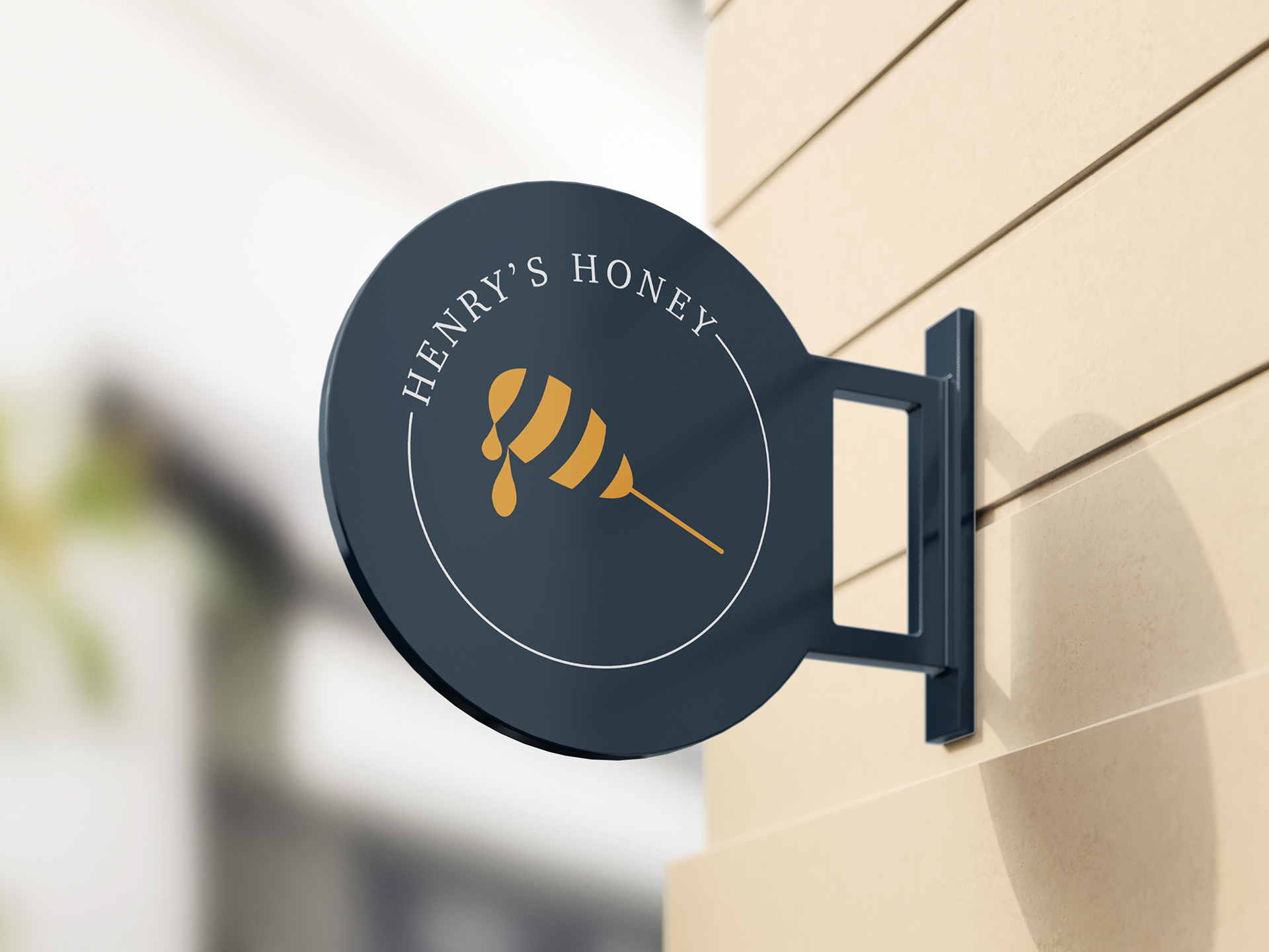
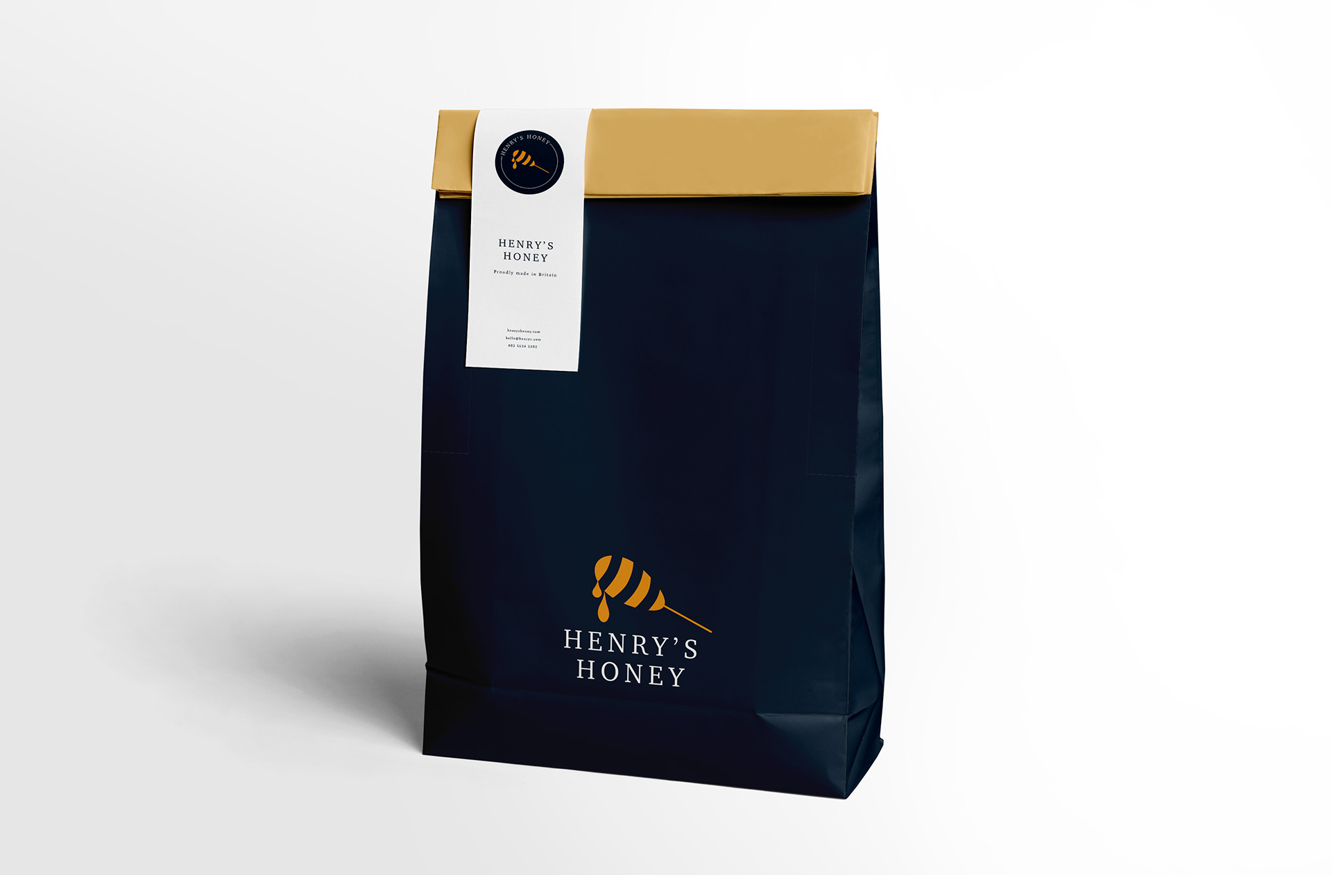
Henry's Honey is a premium British company that pride themselves on producing luxury, organic honey. The challenge was to create a brand new logo and label design that represents the high-end, pure honey that Henry’s produce. The client wanted the branding to be clean, modern, and to stand out on supermarket shelves.
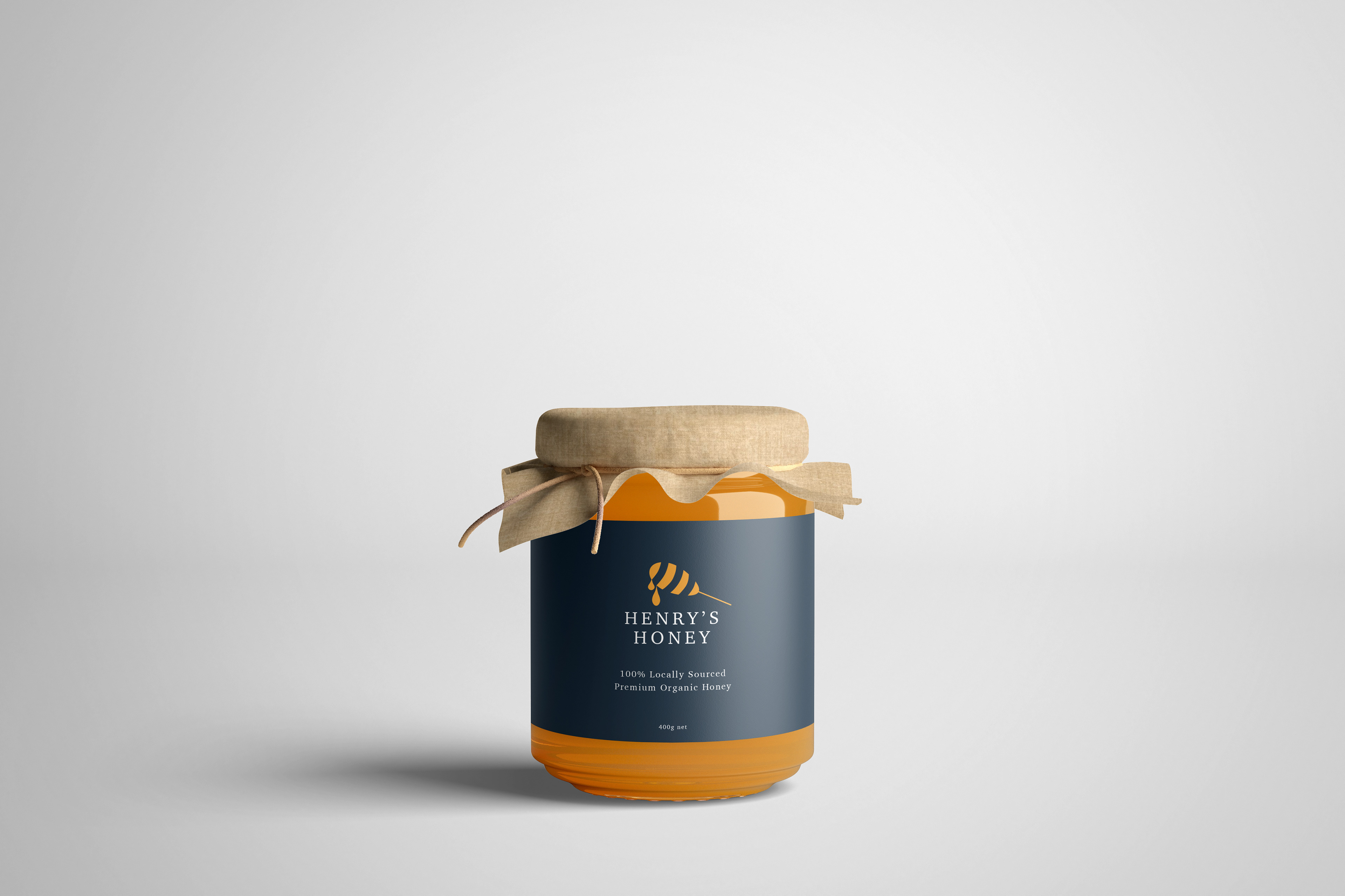
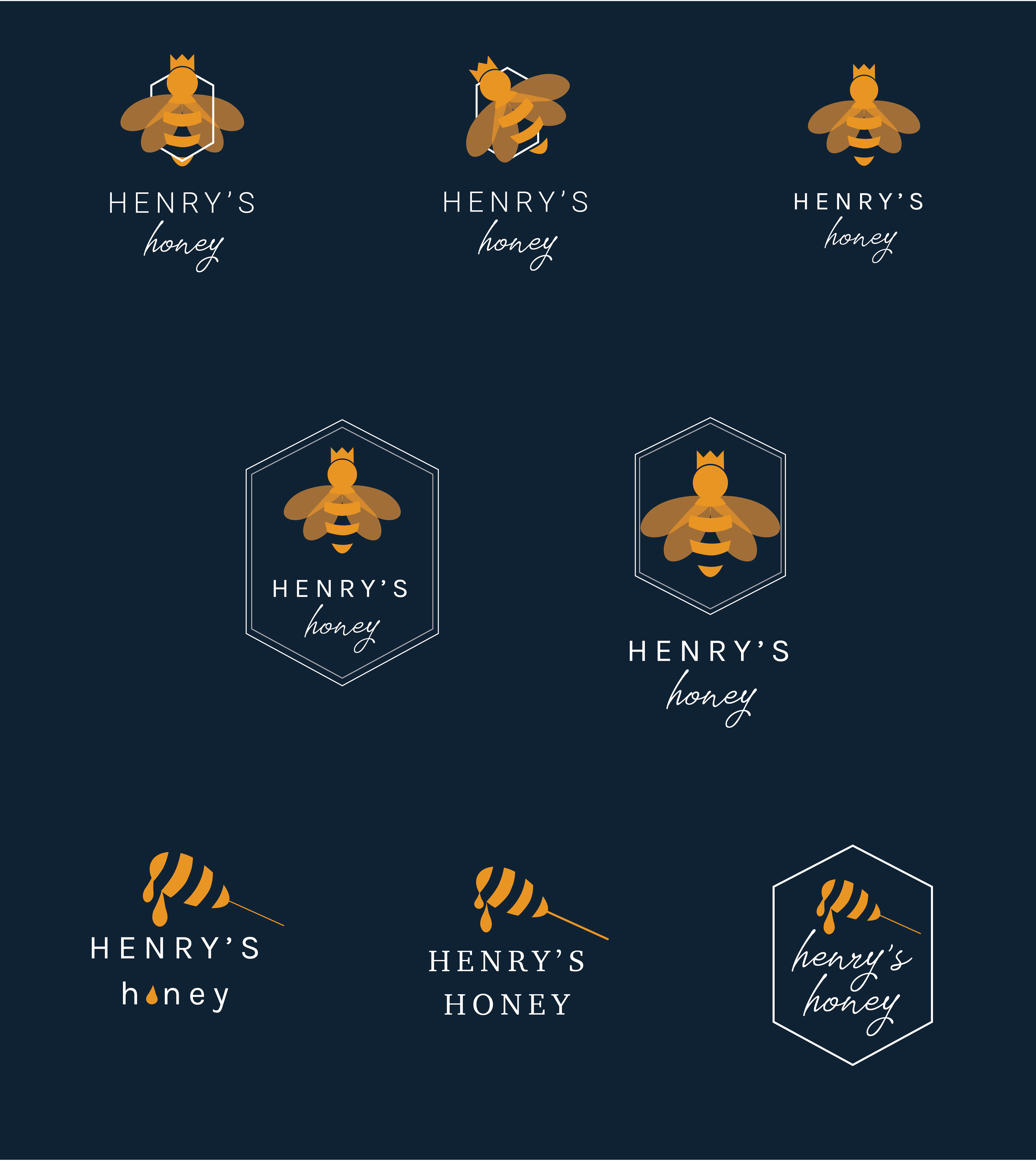
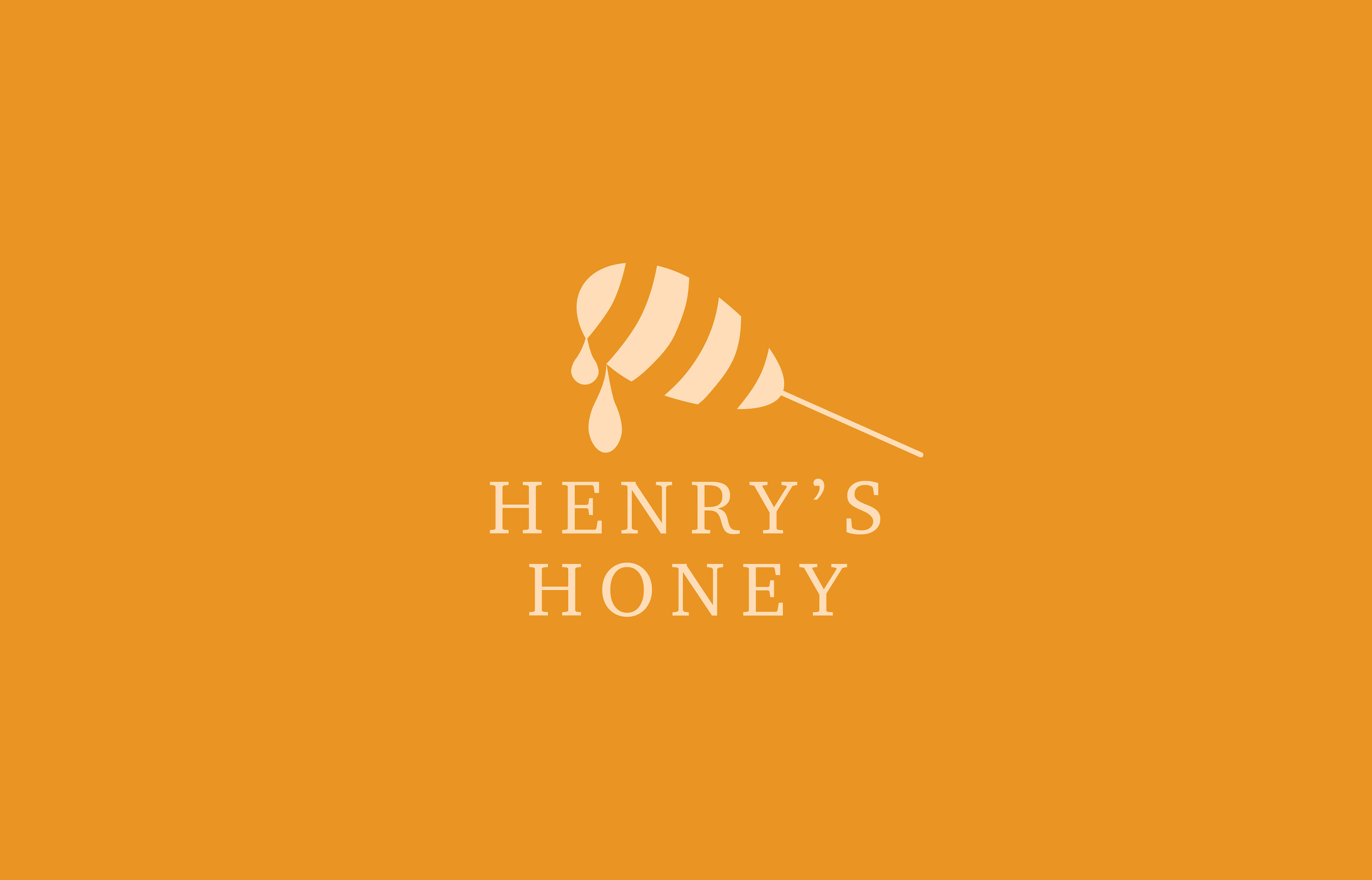
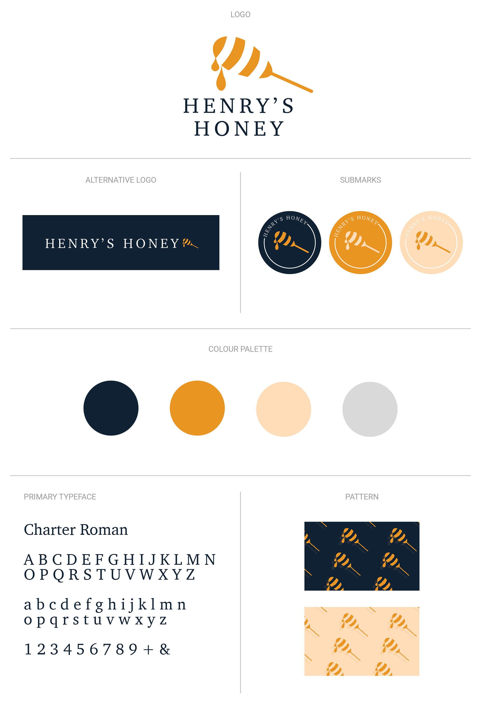
The logo was created using an illustration of a honey dipper. I wanted to ensure the iconography would be unique enough to stand apart from competitors, whilst also feeling familiar to the customer. Using strong bold colours, I focused on keeping the illustration minimal and clean.

Style Guidelines
The Process
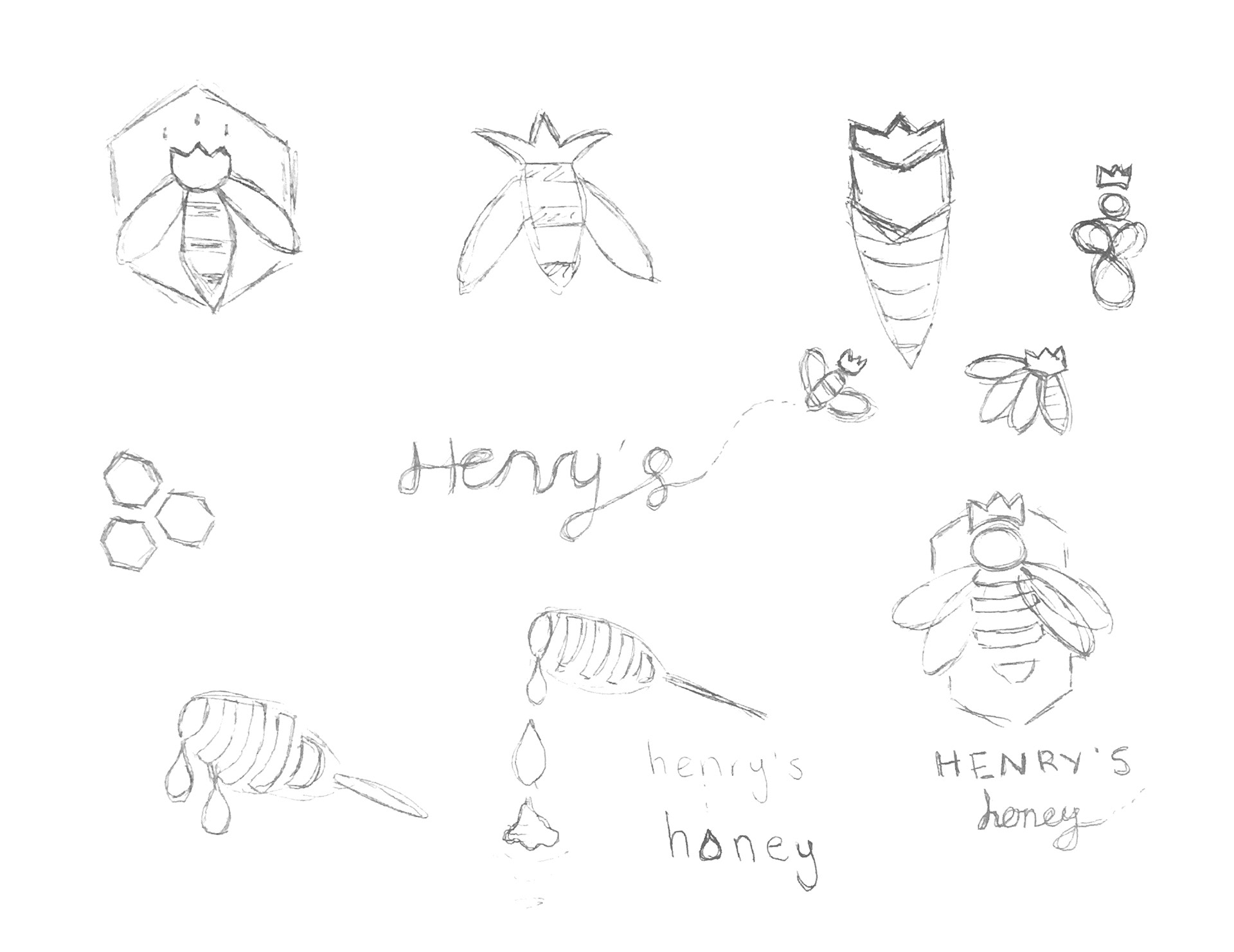
I started with brainstorming key words and ideas based on the given brief, narrowing down how I wanted to approach the challenge. I then translated those ideas into rough sketches. In the beginning I was focused on trying to incorporate the image of a bee as that is the most common association with honey. As well as playing with the idea of a 'Queen Bee' with a crown, to connect to British royalty. As I progressed, I felt I could take the elements of a bee image and use that in a more unique way, as 'standing out on supermarket shelves' was a key point in the brief. This is where I started to develop the logo using a honey dipper, but with the striped design often see in bee illustrations.

I then started to develop my ideas digitally, iterating extensively as I find this an extremely important part of my design process. I realised as I iterated the logo, that 'less is more'. By embracing negative space, I felt the branding better portrayed the elegance and luxuriousness that Henry's Honey prides itself on.